How to create Tooltips - Examples and Libraries
Tooltips in Android are small, informative messages that appear when a user long-presses on an element or hovers over it. They are used to provide users with contextual information about the element they are interacting with, such as the purpose of a button or the meaning of an icon.
In this article, we will learn how to implement tooltips in Android using Kotlin.
Step 1: Adding the Support Library
To use tooltips in Android, we need to add the androidx.appcompat.widget.TooltipCompat class, which is part of the Android Support Library. To do this, we need to add the following line to our app's build.gradle file:
implementation 'androidx.appcompat:appcompat:1.2.0'
Step 2: Adding a Tooltip to an Element
To add a tooltip to an element, we need to call the TooltipCompat.setTooltipText() method and pass in the element we want to add the tooltip to and the text we want to display in the tooltip. Here's an example:
val button = findViewById<Button>(R.id.my_button)
TooltipCompat.setTooltipText(button, "Click me!")
In this example, we're adding a tooltip to a button with an ID of my_button and setting the tooltip text to "Click me!".
Step 3: Customizing the Tooltip
We can customize the appearance of the tooltip by creating a custom style in our app's styles.xml file. Here's an example:
<style name="MyTooltipStyle" parent="@style/Widget.AppCompat.Tooltip">
    <item name="android:textAppearance">@style/TextAppearance.AppCompat.Tooltip</item>
    <item name="android:background">@drawable/my_tooltip_background</item>
    <item name="android:textColor">@color/my_tooltip_text_color</item>
</style>
In this example, we're creating a custom style called MyTooltipStyle that inherits from the Widget.AppCompat.Tooltip style. We're then setting the text appearance, background, and text color of the tooltip to custom values.
To apply this custom style to a tooltip, we need to call the TooltipCompat.setTooltipText() method and pass in the element we want to add the tooltip to, the text we want to display in the tooltip, and the custom style we want to apply. Here's an example:
val button = findViewById<Button>(R.id.my_button)
val tooltipText = "Click me!"
val tooltipStyle = R.style.MyTooltipStyle
TooltipCompat.setTooltipText(button, tooltipText, tooltipStyle)
In this example, we're adding a tooltip to a button with an ID of my_button, setting the tooltip text to "Click me!", and applying the custom style MyTooltipStyle.
Step 4: Handling Long Presses
By default, tooltips in Android appear when a user long-presses on an element. However, we can also trigger the appearance of a tooltip programmatically by calling the TooltipCompat.show() method and passing in the element we want to show the tooltip for and the text we want to display in the tooltip. Here's an example:
val button = findViewById<Button>(R.id.my_button)
val tooltipText = "Click me!"
TooltipCompat.show(button, tooltipText)
In this example, we're showing a tooltip for a button with an ID of my_button and setting the tooltip text to "Click me!".
Using Libraries
Hints and simple previews can now be easily shown using the Tooltip solutions we will discuss in this article. Most of these solutions will comprise libraries and how to use them. The main reason for using tooltips is that they allow you to show hints without permanently occuppying space in the screen. Thus your UI design doesn't suffer yet you make your app user friendly.
Here are the solutions:
(a). Use Target Tooltip
Create Toast like tooltips, but targets can be specified, plus custom properties and features.
Check the demo:

Step 1: Install it
The library is hosted in jitpack so you start by specifying in your root level build file:
allprojects {
    repositories {
        ...
        maven { url 'https://jitpack.io' }
    }
}
Then specify the implementation statement in the app level build file:
implementation 'com.github.sephiroth74:android-target-tooltip:2.0.4'
Step 2: Write Code
The next step is to write code. You can use the builder pattern to create and set different configurations to the Tooltip. Here's example kotlin code:
    val tooltip = Tooltip.Builder(Context)
        .anchor(View, Int, Int, Boolean)
        .anchor(Int, Int)
        .text(CharSequence)
        .styleId(Int)
        .typeface(Typeface)
        .maxWidth(Int)
        .arrow(Boolean)
        .floatingAnimation(Tooltip.Animation)
        .closePolicy(ClosePolicy)
        .showDuration(Long)
        .fadeDuration(Long)
        .overlay(Boolean)
        .create()

    tooltip
        .doOnHidden { }
        .doOnFailure { }
        .doOnShown { }
        .show(View, Tooltip.Gravity, Boolean)
Styling Tooltip
This library gives the capabilty to style your tooltips appropriately:
    <!-- default style -->
    <declare-styleable name="TooltipLayout">
        <attr name="ttlm_padding" format="dimension" />
        <attr name="ttlm_strokeColor" format="color" />
        <attr name="ttlm_backgroundColor" format="color" />
        <attr name="ttlm_strokeWeight" format="dimension" />
        <attr name="ttlm_cornerRadius" format="dimension" />
        <attr name="ttlm_arrowRatio" format="float" />
        <attr name="android:textAppearance" />
        <attr name="ttlm_overlayStyle" format="reference" />
        <attr name="ttlm_elevation" format="dimension" />

        <!-- font file path inside your assets folder -->
        <attr name="ttlm_font" format="string" />

        <!-- textview text gravity -->
        <attr name="android:gravity" />
    </declare-styleable>
And this is the style for the overlay touch:
    <declare-styleable name="TooltipOverlay">
        <attr name="android:color" />
        <attr name="android:alpha" />
        <attr name="ttlm_repeatCount" format="integer" />
        <attr name="ttlm_duration" format="integer" />
        <attr name="android:layout_margin" />
    </declare-styleable>
then pass the style in the Builder method withStyleId(int resId)
Example
Here is a tooltip usage with an activity, written in kotlin:
MainActivity.kt
import android.os.Bundle
import androidx.appcompat.app.AppCompatActivity
import androidx.core.text.toSpannable
import it.sephiroth.android.library.numberpicker.doOnProgressChanged
import it.sephiroth.android.library.xtooltip.ClosePolicy
import it.sephiroth.android.library.xtooltip.Tooltip
import it.sephiroth.android.library.xtooltip.Typefaces
import kotlinx.android.synthetic.main.content_main.*
import timber.log.Timber

class MainActivity : AppCompatActivity() {
    var tooltip: Tooltip? = null

    override fun onCreate(savedInstanceState: Bundle?) {
        super.onCreate(savedInstanceState)
        setContentView(R.layout.activity_main)

        val metrics = resources.displayMetrics

        button1.setOnClickListener { button ->

            val gravity = Tooltip.Gravity.valueOf(spinner_gravities.selectedItem.toString())
            val closePolicy = getClosePolicy()
            val typeface = if (checkbox_font.isChecked) Typefaces[this, "fonts/GillSans.ttc"] else null
            val animation = if (checkbox_animation.isChecked) Tooltip.Animation.DEFAULT else null
            val showDuration = seekbar_duration.progress.toLong()
            val arrow = checkbox_arrow.isChecked
            val overlay = checkbox_overlay.isChecked
            val style = if (checkbox_style.isChecked) R.style.ToolTipAltStyle else null
            val text =
                    if (text_tooltip.text.isNullOrEmpty()) text_tooltip.hint else text_tooltip.text!!.toString()

            Timber.v("gravity: $gravity")
            Timber.v("closePolicy: $closePolicy")

            tooltip?.dismiss()

            tooltip = Tooltip.Builder(this)
                    .anchor(button, 0, 0, false)
                    .text(text)
                    .styleId(style)
                    .typeface(typeface)
                    .maxWidth(metrics.widthPixels / 2)
                    .arrow(arrow)
                    .floatingAnimation(animation)
                    .closePolicy(closePolicy)
                    .showDuration(showDuration)
                    .overlay(overlay)
                    .create()

            tooltip
                    ?.doOnHidden {
                        tooltip = null
                    }
                    ?.doOnFailure { }
                    ?.doOnShown {}
                    ?.show(button, gravity, true)
        }

        button2.setOnClickListener {
            val fragment = TestDialogFragment.newInstance()
            fragment.showNow(supportFragmentManager, "test_dialog_fragment")
        }

        seekbar_duration.doOnProgressChanged { numberPicker, progress, formUser ->
            text_duration.text = "Duration: ${progress}ms"
        }

    }

    private fun getClosePolicy(): ClosePolicy {
        val builder = ClosePolicy.Builder()
        builder.inside(switch1.isChecked)
        builder.outside(switch3.isChecked)
        builder.consume(switch2.isChecked)
        return builder.build()
    }

    override fun onDestroy() {
        Timber.i("onDestroy")
        super.onDestroy()
        tooltip?.dismiss()
    }

}
And here's tooltip usage with a dialog fragment:
package it.sephiroth.android.library.tooltip_demo

import android.os.Bundle
import android.view.LayoutInflater
import android.view.View
import android.view.ViewGroup
import androidx.fragment.app.DialogFragment
import it.sephiroth.android.library.xtooltip.ClosePolicy
import it.sephiroth.android.library.xtooltip.Tooltip
import kotlinx.android.synthetic.main.dialog_fragment.*

class TestDialogFragment : DialogFragment() {

    override fun onCreateView(inflater: LayoutInflater, container: ViewGroup?, savedInstanceState: Bundle?): View? {
        return inflater.inflate(R.layout.dialog_fragment, container, false)
    }

    override fun onViewCreated(view: View, savedInstanceState: Bundle?) {
        super.onViewCreated(view, savedInstanceState)

        button1.setOnClickListener { button ->
            Tooltip.Builder(context!!)
                .anchor(button, 0, 0, false)
                .closePolicy(ClosePolicy.TOUCH_ANYWHERE_CONSUME)
                .showDuration(0)
                .text("This is a dialog")
                .create()
                .show(button, Tooltip.Gravity.TOP, false)
        }
    }

    companion object {
        fun newInstance(): TestDialogFragment {
            val frag = TestDialogFragment()
            return frag
        }
    }
}
Find code here.
Reference
Find code reference here.
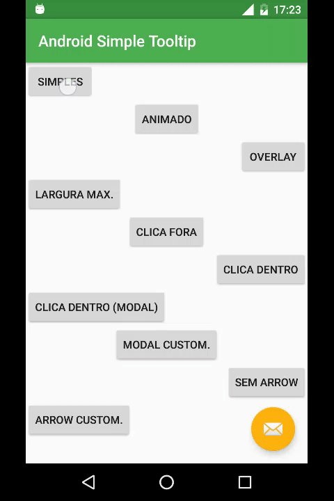
(b). Use Android Simple tooltip
A simple library based on PopupWindow to create Tooltips on Android.
Here are its features:
- Working from Android 4.0 (API 14)
- Simple to use: few parameters in a single line of code
- Animation with speed and size control
- Option to close with touch inside or outside of the tooltip.
- Modal mode (prevents touch in the background)
- Overlay (darkens the background highlighting the anchor)
- Customizable arrow
- Inflatable content from a
VieworXMLlayout. - Colors and dimensions customized by
BuilderorXMLresources
Here's a demo:
Step 1: Install it
Add jitpack as a maven url in your build.gradle file:
allprojects {
    repositories {
        ...
        maven { url "https://jitpack.io" }
    }
}
Then the implementation statement in the app module's build.gradle:
implementation 'com.github.douglasjunior:android-simple-tooltip:1.0.0-rc.0'
}
Step 2: Write Code
First reference the view onto which you will anchor the tooltip:
View yourView = findViewById(R.id.your_view);
Now build the tooltip, anchor it and set more configurations:
new SimpleTooltip.Builder(this)
    .anchorView(yourView)
    .text("Texto do Tooltip")
    .gravity(Gravity.END)
    .animated(true)
    .transparentOverlay(false)
    .build()
    .show();
That's it.
Step 3: Customize
You can also customize the tooltip as per your needs:
For example to change colors:
<color name="simpletooltip_background">@color/colorAccent</color>
<color name="simpletooltip_text">@android:color/primary_text_light</color>
<color name="simpletooltip_arrow">@color/colorAccent</color>
To chnage dimensions:
<dimen name="simpletooltip_max_width">150dp</dimen>
<dimen name="simpletooltip_overlay_offset">10dp</dimen>
<dimen name="simpletooltip_margin">10dp</dimen>
<dimen name="simpletooltip_padding">8dp</dimen>
<dimen name="simpletooltip_arrow_width">30dp</dimen>
<dimen name="simpletooltip_arrow_height">15dp</dimen>
<dimen name="simpletooltip_animation_padding">4dp</dimen>
<integer name="simpletooltip_overlay_alpha">120</integer>
<integer name="simpletooltip_animation_duration">800</integer>
<style name="simpletooltip_default" parent="@android:style/TextAppearance.Me
Example
Here is a full example:
MainActivity.java
import android.app.Dialog;
import android.graphics.Color;
import android.os.Bundle;
import android.view.Gravity;
import android.view.View;
import android.widget.Button;
import android.widget.EditText;

import androidx.appcompat.app.AppCompatActivity;
import androidx.appcompat.widget.Toolbar;

import com.google.android.material.floatingactionbutton.FloatingActionButton;

import io.github.douglasjunior.androidSimpleTooltip.OverlayView;
import io.github.douglasjunior.androidSimpleTooltip.SimpleTooltip;
import io.github.douglasjunior.androidSimpleTooltip.SimpleTooltipUtils;

/**
 * MainActivity
 * Created by douglas on 09/05/16.
 */
@SuppressWarnings("ConstantConditions")
public class MainActivity extends AppCompatActivity implements View.OnClickListener {

    @Override
    protected void onCreate(Bundle savedInstanceState) {
        super.onCreate(savedInstanceState);
        setContentView(R.layout.activity_main);
        Toolbar toolbar = (Toolbar) findViewById(R.id.toolbar);
        setSupportActionBar(toolbar);

        FloatingActionButton fab = (FloatingActionButton) findViewById(R.id.fab);
        fab.setOnClickListener(this);

        findViewById(R.id.btn_simple).setOnClickListener(this);
        findViewById(R.id.btn_animated).setOnClickListener(this);
        findViewById(R.id.btn_overlay).setOnClickListener(this);
        findViewById(R.id.btn_maxwidth).setOnClickListener(this);
        findViewById(R.id.btn_outside).setOnClickListener(this);
        findViewById(R.id.btn_inside).setOnClickListener(this);
        findViewById(R.id.btn_inside_modal).setOnClickListener(this);
        findViewById(R.id.btn_modal_custom).setOnClickListener(this);
        findViewById(R.id.btn_no_arrow).setOnClickListener(this);
        findViewById(R.id.btn_custom_arrow).setOnClickListener(this);
        findViewById(R.id.btn_dialog).setOnClickListener(this);
        findViewById(R.id.btn_center).setOnClickListener(this);
        findViewById(R.id.btn_overlay_rect).setOnClickListener(this);
    }

    @Override
    public void onClick(final View v) {
        if (v.getId() == R.id.fab) {
            new SimpleTooltip.Builder(this)
                    .anchorView(v)
                    .text("Floating Action Button")
                    .gravity(Gravity.START)
                    .onDismissListener(new SimpleTooltip.OnDismissListener() {
                        @Override
                        public void onDismiss(SimpleTooltip tooltip) {
                            System.out.println("dismiss " + tooltip);
                        }
                    })
                    .onShowListener(new SimpleTooltip.OnShowListener() {
                        @Override
                        public void onShow(SimpleTooltip tooltip) {
                            System.out.println("show " + tooltip);
                        }
                    })
                    .build()
                    .show();

        } else if (v.getId() == R.id.btn_simple) {
            new SimpleTooltip.Builder(this)
                    .anchorView(v)
                    .text(R.string.btn_simple)
                    .gravity(Gravity.END)
                    .build()
                    .show();

        } else if (v.getId() == R.id.btn_animated) {
            new SimpleTooltip.Builder(this)
                    .anchorView(v)
                    .text(R.string.btn_animated)
                    .gravity(Gravity.TOP)
                    .animated(true)
                    .build()
                    .show();

        } else if (v.getId() == R.id.btn_overlay) {
            new SimpleTooltip.Builder(this)
                    .anchorView(v)
                    .text(R.string.btn_overlay)
                    .gravity(Gravity.START)
                    .animated(true)
                    .transparentOverlay(false)
                    .overlayWindowBackgroundColor(Color.BLACK)
                    .build()
                    .show();

        } else if (v.getId() == R.id.btn_maxwidth) {
            new SimpleTooltip.Builder(this)
                    .anchorView(v)
                    .text(getString(R.string.btn_maxwidth) + getString(R.string.btn_maxwidth) + getString(R.string.btn_maxwidth) + getString(R.string.btn_maxwidth) + getString(R.string.btn_maxwidth))
                    .gravity(Gravity.END)
                    .maxWidth(R.dimen.simpletooltip_max_width)
                    .build()
                    .show();

        } else if (v.getId() == R.id.btn_outside) {
            new SimpleTooltip.Builder(this)
                    .anchorView(v)
                    .text(R.string.btn_outside)
                    .gravity(Gravity.BOTTOM)
                    .dismissOnOutsideTouch(true)
                    .dismissOnInsideTouch(false)
                    .build()
                    .show();

        } else if (v.getId() == R.id.btn_inside) {
            new SimpleTooltip.Builder(this)
                    .anchorView(v)
                    .text(R.string.btn_inside)
                    .gravity(Gravity.START)
                    .dismissOnOutsideTouch(false)
                    .dismissOnInsideTouch(true)
                    .build()
                    .show();

        } else if (v.getId() == R.id.btn_inside_modal) {
            new SimpleTooltip.Builder(this)
                    .anchorView(v)
                    .text(R.string.btn_inside_modal)
                    .gravity(Gravity.END)
                    .dismissOnOutsideTouch(false)
                    .dismissOnInsideTouch(true)
                    .modal(true)
                    .build()
                    .show();

        } else if (v.getId() == R.id.btn_modal_custom) {
            final SimpleTooltip tooltip = new SimpleTooltip.Builder(this)
                    .anchorView(v)
                    .text(R.string.btn_modal_custom)
                    .gravity(Gravity.TOP)
                    .dismissOnOutsideTouch(false)
                    .dismissOnInsideTouch(false)
                    .modal(true)
                    .animated(true)
                    .animationDuration(2000)
                    .animationPadding(SimpleTooltipUtils.pxFromDp(50))
                    .contentView(R.layout.tooltip_custom, R.id.tv_text)
                    .focusable(true)
                    .build();

            final EditText ed = tooltip.findViewById(R.id.ed_text);

            tooltip.findViewById(R.id.btn_next).setOnClickListener(new View.OnClickListener() {
                @Override
                public void onClick(View v2) {
                    if (tooltip.isShowing())
                        tooltip.dismiss();
                    new SimpleTooltip.Builder(v.getContext())
                            .anchorView(v)
                            .text(ed.getText())
                            .gravity(Gravity.BOTTOM)
                            .build()
                            .show();
                }
            });

            tooltip.show();
        } else if (v.getId() == R.id.btn_no_arrow) {
            new SimpleTooltip.Builder(this)
                    .anchorView(v)
                    .text(R.string.btn_no_arrow)
                    .gravity(Gravity.START)
                    .showArrow(false)
                    .modal(true)
                    .animated(true)
                    .build()
                    .show();

        } else if (v.getId() == R.id.btn_custom_arrow) {
            new SimpleTooltip.Builder(this)
                    .anchorView(v)
                    .text(R.string.btn_custom_arrow)
                    .gravity(Gravity.END)
                    .modal(true)
                    .arrowDrawable(android.R.drawable.ic_media_previous)
                    .arrowHeight((int) SimpleTooltipUtils.pxFromDp(50))
                    .arrowWidth((int) SimpleTooltipUtils.pxFromDp(50))
                    .build()
                    .show();

        } else if (v.getId() == R.id.btn_dialog) {
            final Dialog dialog = new Dialog(this);
            dialog.setContentView(R.layout.dialog);
            dialog.show();

            final Button btnInDialog = (Button) dialog.findViewById(R.id.btn_in_dialog);
            btnInDialog.setOnClickListener(new View.OnClickListener() {
                @Override
                public void onClick(View v) {
                    new SimpleTooltip.Builder(MainActivity.this)
                            .anchorView(btnInDialog)
                            .text(R.string.btn_in_dialog)
                            .gravity(Gravity.BOTTOM)
                            .animated(true)
                            .transparentOverlay(false)
                            .overlayMatchParent(false)
                            .build()
                            .show();
                }
            });
            final Button btnClose = (Button) dialog.findViewById(R.id.btn_close);
            btnClose.setOnClickListener(new View.OnClickListener() {
                @Override
                public void onClick(View v) {
                    dialog.dismiss();
                }
            });
        } else if (v.getId() == R.id.btn_center) {
            new SimpleTooltip.Builder(this)
                    .anchorView(v.getRootView())
                    .text(R.string.btn_center)
                    .showArrow(false)
                    .gravity(Gravity.CENTER)
                    .build()
                    .show();
        } else if (v.getId() == R.id.btn_overlay_rect) {
            new SimpleTooltip.Builder(this)
                    .anchorView(v)
                    .text(R.string.btn_overlay_rect)
                    .gravity(Gravity.END)
                    .animated(true)
                    .transparentOverlay(false)
                    .highlightShape(OverlayView.HIGHLIGHT_SHAPE_RECTANGULAR)
                    .overlayOffset(0)
                    .build()
                    .show();
        }
    }
}
You can find the full example here.
Reference
Find full code reference here.
Conclusion
Tooltips are a great way to provide users with contextual information about the elements they are interacting with in an Android app. By following the steps outlined in this article, you should now be able to easily add and customize tooltips in your own Android app.